Being avid travelers ourselves, we wanted to work with some Airbnb data and visualize Airbnb listing data in a way to help tourists plan for their trip ahead. We decided to choose the city of Boston since we already live there and have an understanding of the city landscape and how neighborhoods are different from each other.
Boston is a very walkable city with many popular touristy spots clustered around certain areas in the city. With this visualization tool, we hope to help travelers plan their trip and book their Airbnb stay close to T-stops to minimize travel costs while exploring the city and sightseeing.
Our A3 focuses on a high-level view of the city that enables users to interact with the map and select Airbnb listings based on their preferences such as price range and room types. We went through several iterations of design sprints before we decided on the current version. See “Development Process” section for more details.
This visualization shows a map of the Boston T-stop and all Airbnb listings within a walkable 1,000-meter radius around any given T-stop. You can mouse over any given T-stop and see the number of Airbnb listings and their average price based on your selection criterion. Additionally, the size of the circles reflect the magnitude of the number of Airbnb listings that fulfill the selected criterion. Through this interactive visualization, you can actually identify patterns and draw some inference from the data, such as the correlation between location in the city and Airbnb pricing. Another example would be the correlation between concentration of Airbnb listings and tourist attractions.
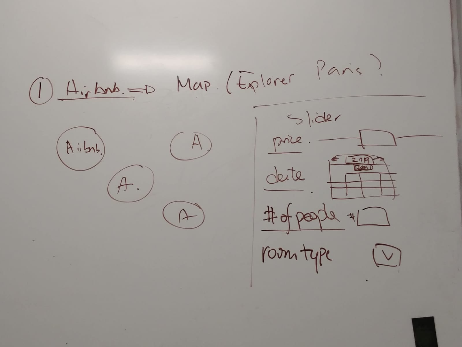
Preliminary sketches on a whiteboard.